pacman::p_load(tmap, sf, tidyverse, knitr, sfdep, plotly)In Class Exercise 2: Emerging Hot Spot Analysis: sfdep methods
Getting Started
Five R packages will be used in this in-class exercise.
Please note that plotly is used in this hands-on exercise:
To take note on the learning points for this hands-on exercise
Emerging Hot Spot Analysis (EHSA) is a spatio-temporal analysis method for revealing and describing how hot spot and cold spot areas evolve over time. The analysis consist of four main steps:
Building a space-time cube,
Calculating Getis-Ord local Gi* statistic for each bin by using an FDR correction,
Evaluating these hot and cold spot trends by using Mann-Kendall trend test,
Categorising each study area location by referring to the resultant trend z-score and p-value for each location with data, and with the hot spot z-score and p-value for each bin.
The Data
Same data will be used, except that apatial will be Hunan_GDPPC, an attribute data set in csv format instead.
Import geospatial data
hunan <- st_read(dsn = "data/geospatial",
                   layer = "Hunan")
Reading layer `Hunan' from data source
`C:\czx0727\ISSS624_\in_class_ex2\data\geospatial' using driver `ESRI Shapefile'
Simple feature collection with 88 features and 7 fields
Geometry type: POLYGON
Dimension: XY
Bounding box: xmin: 108.7831 ymin: 24.6342 xmax: 114.2544 ymax: 30.12812
Geodetic CRS: WGS 84Import apatial data
GDPPC <- read_csv("data/aspatial/Hunan_GDPPC.csv")Rows: 1496 Columns: 3
── Column specification ────────────────────────────────────────────────────────
Delimiter: ","
chr (1): County
dbl (2): Year, GDPPC
ℹ Use `spec()` to retrieve the full column specification for this data.
ℹ Specify the column types or set `show_col_types = FALSE` to quiet this message.Creating a Time Series Cube
In the code chunk below, spacetime() of sfdep is used to create an spacetime cube.
GDPPC_st <- spacetime(GDPPC, hunan,
                      .loc_col = "County",
                      .time_col = "Year")
Next, is_spacetime_cube() of sfdep package will be used to varify if GDPPC_st is indeed an space-time cube object.
is_spacetime_cube(GDPPC_st)[1] TRUETo note: The TRUE return confirms that GDPPC_st object is indeed an time-space cube.
If it is FALSE, it will have complications
Computing GI*
The code chunk below will be used to identify neighbors and to derive an inverse distance weights.
GDPPC_nb <- GDPPC_st %>%
  activate("geometry") %>%
  mutate(nb = include_self(st_contiguity(geometry)),
         wt = st_inverse_distance(nb, geometry,
                                  scale = 1,
                                  alpha = 1),
         .before = 1) %>%
  set_nbs("nb") %>%
  set_wts("wt")
! Polygon provided. Using point on surface.Warning: There was 1 warning in `stopifnot()`.
ℹ In argument: `wt = st_inverse_distance(nb, geometry, scale = 1, alpha = 1)`.
Caused by warning in `st_point_on_surface.sfc()`:
! st_point_on_surface may not give correct results for longitude/latitude dataNote that this dataset now has neighbors and weights for each time-slice.
head(GDPPC_nb)spacetime ────Context:`data`88 locations `County`17 time periods `Year`── data context ────────────────────────────────────────────────────────────────# A tibble: 6 × 5
Year County GDPPC nb wt
<dbl> <chr> <dbl> <list> <list>
1 2005 Anxiang 8184 <int [6]> <dbl [6]>
2 2005 Hanshou 6560 <int [6]> <dbl [6]>
3 2005 Jinshi 9956 <int [5]> <dbl [5]>
4 2005 Li 8394 <int [5]> <dbl [5]>
5 2005 Linli 8850 <int [5]> <dbl [5]>
6 2005 Shimen 9244 <int [6]> <dbl [6]>We can use these new columns to manually calculate the local Gi* for each location. We can do this by grouping by Year and using local_gstar_perm() of sfdep package. After which, we use unnest() to unnest gi_star column of the newly created gi_starts data.frame.
gi_stars <- GDPPC_nb %>%
  group_by(Year) %>%
  mutate(gi_star = local_gstar_perm(
    GDPPC, nb, wt)) %>%
  tidyr::unnest(gi_star)
Mann-Kendall Test
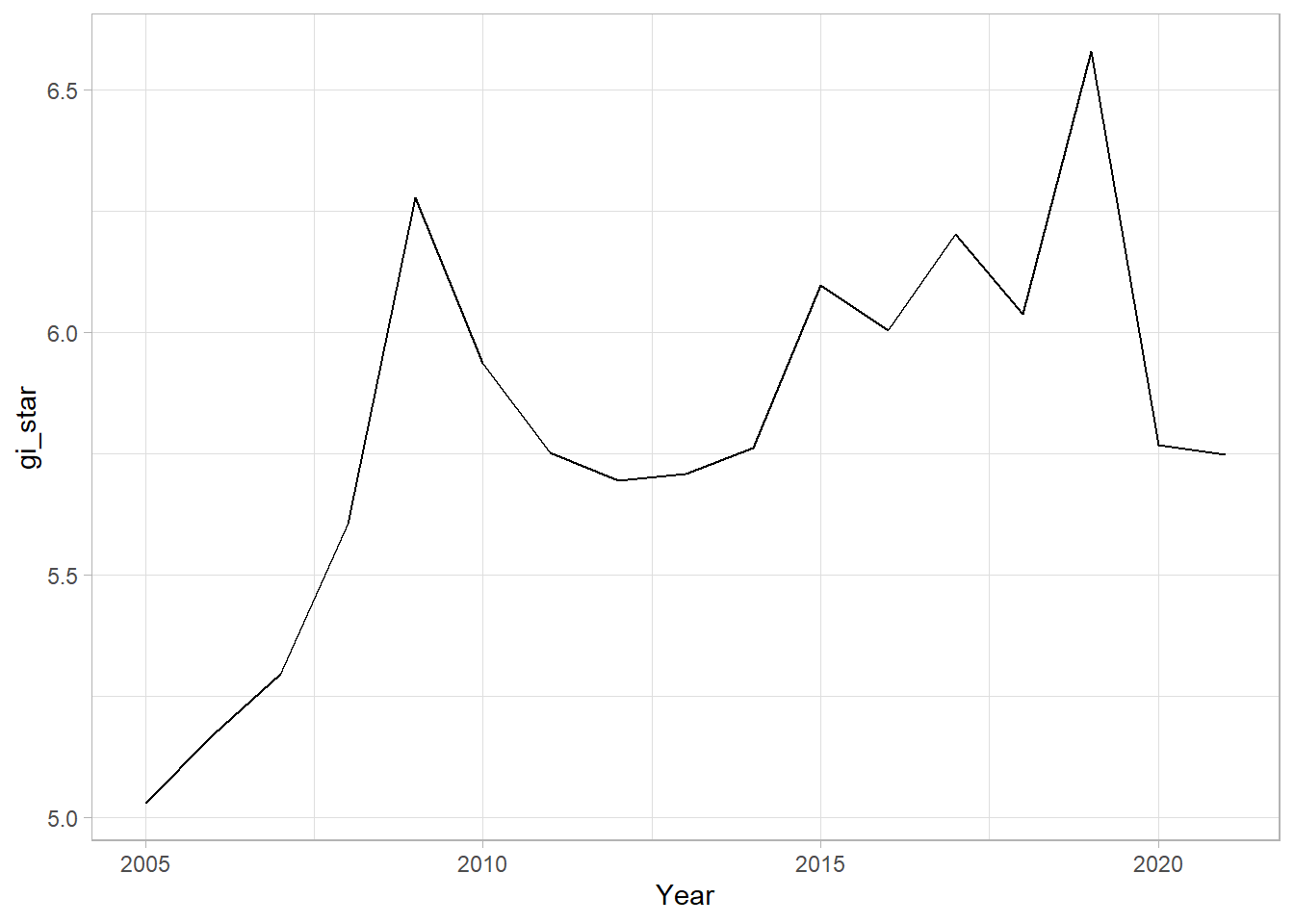
With these Gi* measures we can then evaluate each location for a trend using the Mann-Kendall test. The code chunk below uses Changsha county.
cbg <- gi_stars %>%
  ungroup() %>%
  filter(County == "Changsha") |>
  select(County, Year, gi_star)
Next, we plot the result by using ggplot2 functions.
ggplot(data = cbg,
       aes(x = Year,
           y = gi_star)) +
  geom_line() +
  theme_light()
To take note: We can also create an interactive plot by using ggplotly() of plotly package.
p <- ggplot(data = cbg,
       aes(x = Year,
           y = gi_star)) +
  geom_line() +
  theme_light()

ggplotly(p)
cbg %>%
summarise(mk = list(
unclass(
Kendall::MannKendall(gi_star)))) %>%
tidyr::unnest_wider(mk)# A tibble: 1 × 5
tau sl S D varS
<dbl> <dbl> <dbl> <dbl> <dbl>
1 0.485 0.00742 66 136. 589.In the above result, sl is the p-value. This result tells us that there is a slight upward but insignificant trend.
We can replicate this for each location by using group_by() of dplyr package.
ehsa <- gi_stars %>%
  group_by(County) %>%
  summarise(mk = list(
    unclass(
      Kendall::MannKendall(gi_star)))) %>%
  tidyr::unnest_wider(mk)
Arrange to show significant emerging hot/cold spots
emerging <- ehsa %>%
  arrange(sl, abs(tau)) %>%
  slice(1:5)
Performing Emerging Hotspot Analysis
Lastly, we will perform EHSA analysis by using emerging_hotspot_analysis() of sfdep package.
To note: It takes a spacetime object x (i.e. GDPPC_st), and the quoted name of the variable of interest (i.e. GDPPC) for .var argument. The k argument is used to specify the number of time lags which is set to 1 by default. Lastly, nsim map numbers of simulation to be performed.
ehsa <- emerging_hotspot_analysis(
  x = GDPPC_st,
  .var = "GDPPC",
  k = 1,
  nsim = 99
)
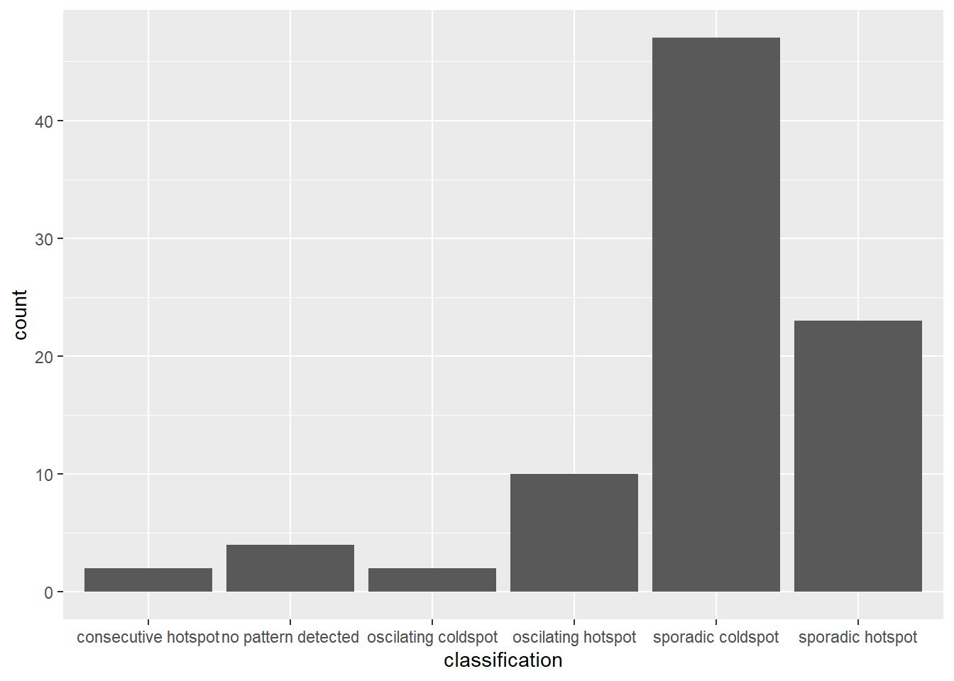
Visualising the distribution of EHSA classes
In the code chunk below, ggplot2 functions ised used to reveal the distribution of EHSA classes as a bar chart.
ggplot(data = ehsa,
       aes(x = classification)) +
  geom_bar()
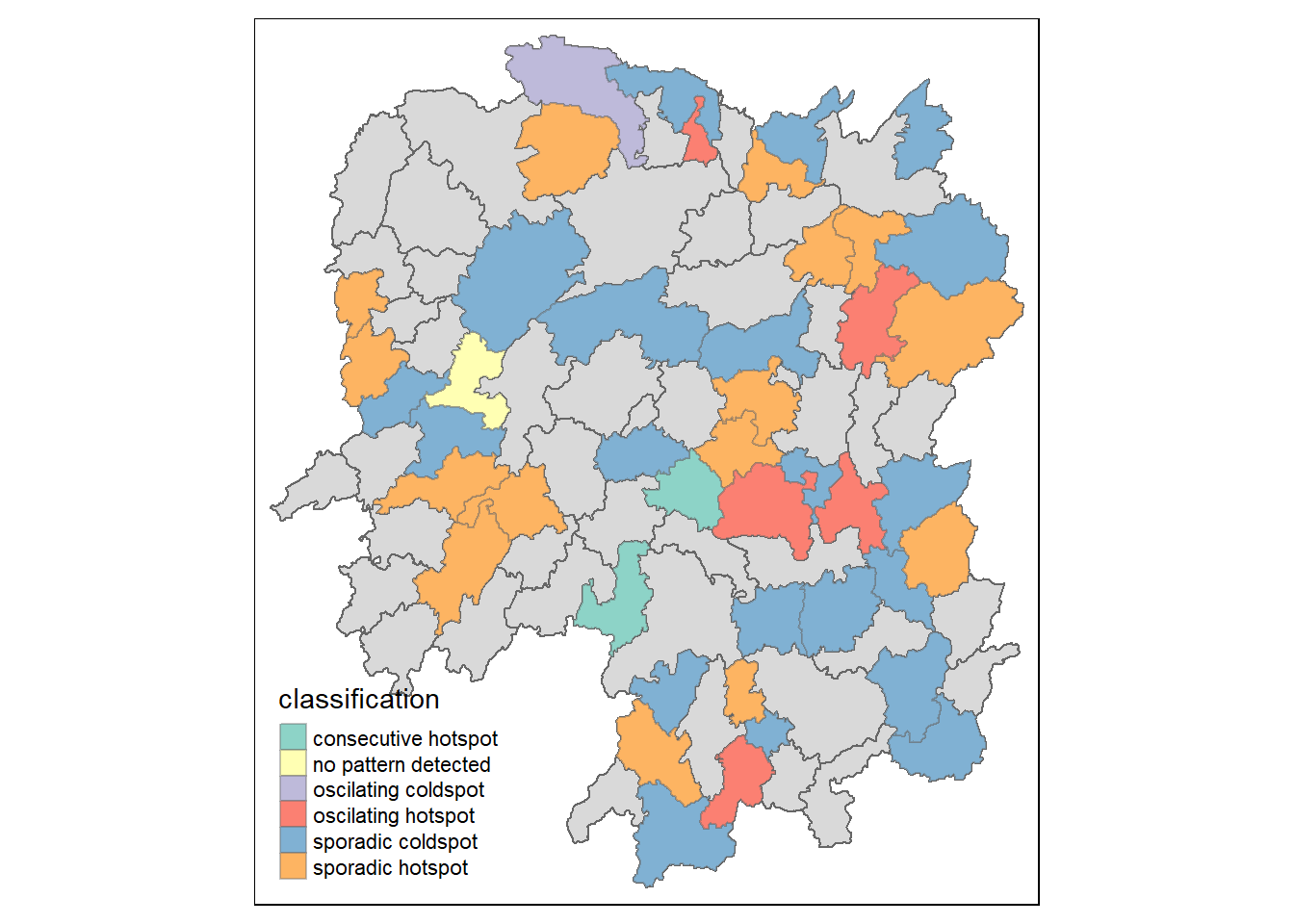
Visualising EHSA
In this section, I will learn how to visualise the geographic distribution EHSA classes. However, before I can do so, I need to join both hunan and ehsa together by using the code chunk below.
hunan_ehsa <- hunan %>%
  left_join(ehsa,
            by = join_by(County == location))
Next, tmap functions will be used to plot a categorical choropleth map by using the code chunk below.
ehsa_sig <- hunan_ehsa  %>%
  filter(p_value < 0.05)
tmap_mode("plot")
tmap mode set to plottingtm_shape(hunan_ehsa) +
tm_polygons() +
tm_borders(alpha = 0.5) +
tm_shape(ehsa_sig) +
tm_fill("classification") +
tm_borders(alpha = 0.4)Warning: One tm layer group has duplicated layer types, which are omitted. To
draw multiple layers of the same type, use multiple layer groups (i.e. specify
tm_shape prior to each of them).